


Chrome is changing its logo for the first time since 2014 though the changes are quite subtle.
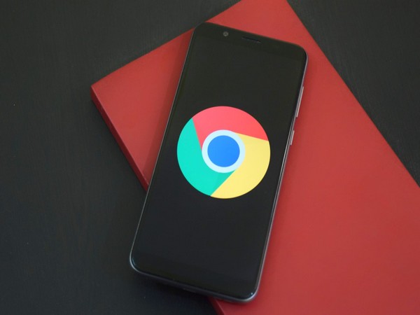
According to The Verge, instead of incorporating shadows on the borders between each colour, essentially “raising” them off the screen, the red, yellow, and green are now simply flat.
Due to these changes, the blue circle in the middle seems to be bigger. The colours in the logo also look more vibrant.
The main Chrome logo won’t look the same across all systems either. On ChromeOS, the logo will look more colourful to complement the other system icons, while on macOS, the logo will have a small shadow, making it appear as if it’s “popping out” of the dock. Meanwhile, the Windows 10 and 11 version has a more dramatic gradient so that it fits in with the style of other Windows icons.
As per The Verge, the new icon can be seen if you use Chrome Canary (the developer version of Chrome), but it will start rolling out for everyone else over the next few months.
There are also some new icons for the beta and developer versions of the Chrome logo, with the most dramatic change being a blueprint-style icon for the beta app on iOS.
From 2008 until now, the Chrome logo has been getting gradually simpler. What started out as a shiny, three-dimensional emblem has been squashed down into a 2D symbol.